One sure way to kill trafic to your site and its ranking on the
major search engins is to comit one or more of the "Web Design
Sins". Join us for thrills and chills as we cover appalling
animation, terrifying text, creepy color combinations, and more.
We've designed a simple Web page that
incorporates all 7 "Design Sins".
Visit
it - if you dare!
1. Annoying Animation
Yes! It's so irritating that we set the
animated GIF to only cycle 25 times.
This technique is most commonly used by
banner advertisements to catch and hold
your attention. Designers sometimes use it
in a Web page's content section to draw
attention to important text. But beware.
Often, the animation draws so much negative
attention that visitors leave your site
immediately and never see that important
content.
Use larger headings and bulleted text
instead of blinking animation to emphasize
important sections...
2. Ransom Note
Text
Some designers get so excited and
bewildered by the variety of fonts and
colors available that they have a hard time
choosing the best ones. So they compromise
and use them all. The end result often
resembles a ransom note cut from several
different magazines.
Ransom note text takes forever to code by
hand since each single letter has a
different font and color. It's easier and
more tempting if you're using a WYSIWYG
editor because you don't have to write the
code, just point and click.
Resist that temptation! Use common fonts
(Arial, Times Roman, etc) because all
browsers recognize them. All the time you
spend optimizing your layout using the
Showcard Gothic font (for instance) will be
wasted if your visitors' browsers don't
recognize it and instead default to Times
Roman.
3. Under Construction
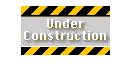
Few Web sites are static. Most are
continually being updated with new
information and optimized for search
engines. In a sense, they're always "under
construction."
However, that message should never appear
on your home page because you're
essentially telling visitors that your site
is a waste of their time. Never submit to
search engines until the site (or at least the
home page) is complete. If you have some
sections of other pages that aren't
complete, it's ok to note that, but avoid
the animated road construction graphic.
4. This Site Best Viewed With ...
Few statements on a Web page annoy visitors
as much as this one. Think about it: have
you ever downloaded a new browser (or
browser version) just to look at a single
Web site? Unless you are absolutely
certain that visitors will use a particular
browser (on a company Intranet, for
example), all sites should be optimized to
display effectively across browsers.
5. Background Music
Background music on a page adds no content
but increases the annoyance factor and
the page download time. It's ok to include
music clips on your site, but give your
visitors the option to listen instead of
assaulting them with a tinny rendition of
Beethoven's Fifth Symphony the instant your
page loads. The choice makes your site
seem more interactive and gives visitors
more control of their experience. If you use music, make sure
there is an "Turn Off Music" button.
6. Horizontal Scrollbars
Horizontal scrollbars decrease a page's
usability because visitors have to manually
scroll the page back and forth to view the
content. Monitor resolution settings can
cause a Web page display to look
drastically different from one monitor to
the next. Visitors with low resolution
monitors are most likely the ones to
encounter horizontal scrollbars.
Remember: if you designed your site with
your monitor display set to 800x600, your
Web page will appear 20% larger (and
fuzzier) on a 640x480 monitor. Most Web
designers have 17-inch monitors set to
800x600 pixel resolution (or higher) and
tend to forget that the rest of the world
is not quite so lucky.
Ideally, you should test your site on a
variety of different monitors, but that can
be difficult if your only access is your
home or office PC. At least adjust the
settings on your own monitor to see how
your page will appear at different
resolutions.
7. Color Combinations
The Web Palette consists of the 216 colors
that both Macintosh and Windows systems
display accurately. Here is another area
where color can get you into trouble. Many
of those 216 colors aren't found in nature
and shouldn't be on your Web site either.